A Dashboard of Shiny Apps
Andy Merlino
2020/07/17

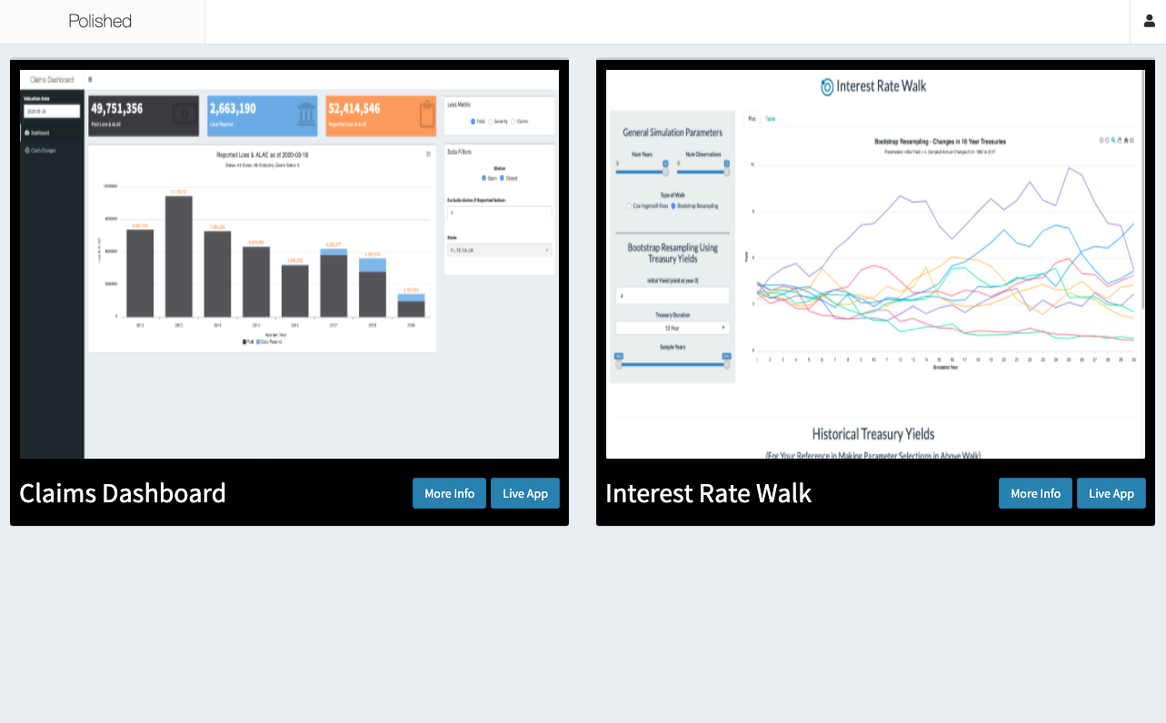
We build a lot of Shiny apps. Once we have more than a couple related Shiny apps, it often makes sense to create a dashboard for our Shiny apps. A dashboard of Shiny apps allows users to easily visualize available apps and navigate between apps. This post covers a simple example of one of these dashboards of Shiny apps. The Shiny apps dashboard looks like this:

The above dashboard of Shiny apps is itself a Shiny app. It displays screenshots and links to 2 other Shiny apps (“Claims Dashboard” on the left and “Interest Rate Walk” on the right). As you would expect, the user can click on the “Live App” buttons to navigate to the actual apps.
The dashboard and each of the Shiny apps in the dashboard use our R package, polished, to secure the app with user authentication. polished manages user authorization on a per app basis, so we can restrict user access to the dashboard and to specific apps in the dashboard (e.g. we could give user A access to only “Claims Dashboard” but not “Interest Rate Walk” and user B access to both apps). Once the user is signed in to the dashboard they can seemlessly navigate to all apps that they are authorized to access. Visit polished.tech to learn more about polished and how to integrate it with your Shiny apps.
Sign in to the live dashboard of Shiny apps here using the following credentials:
- email: demo@tychobra.com
- password: polished
If you really want to dive into the details, the source code is available here.
comments powered by Disqus